A Lakefront Cabin by Jen Samson That’s All About the View
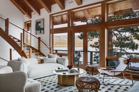
When your home sits perched atop a mountain overlooking one of the most scenic lakes in the country, the last thing you want is to feel cramped. But when Jen Samson was brought onto this project on Lake Tahoe in Nevada, the 1980 home was “dark and dated”—despite its prime location in the Sierras overlooking the water. Samson quickly set about rectifying that, opening up the interiors to allow for light, flow, and, most important, unfettered access to the breathtaking vistas outside.
“Truly one of the most magical spots on all of Lake Tahoe, this home is in Crystal Bay and sits almost literally on top of the water with spectacular views of the lake and the Sierras,” says the designer. But the old owners had leaned into the mountain theme, embracing a dark palette and heavy details with forest motifs. “The dining room had a large inset wall that was painted a dark red, walls were buttercup yellow, fireplaces had oversized wood cabin-like mantels, countertops and decorative tiles were outdated,” Samson explains.
“Per our clients’ direction, the home was to embody a lake home rather than a mountain home. They wanted to make it about the water, not about the skiing.” And now, thanks to the home’s high-quality bones and the creative vision of Samson and Meagher Builders, it is: “Nearly all of the rooms in the four-level home have unobstructed views of the majestic blue waters,” Samson says. Now that’s what we call a lake house.
Staircase
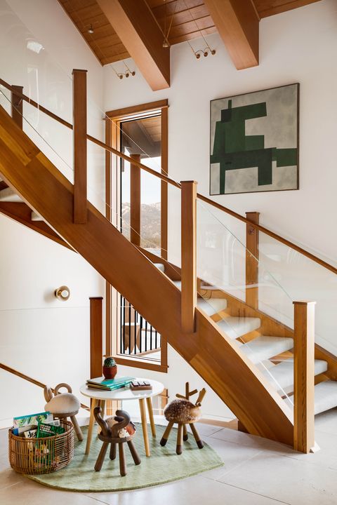
The tones in an abstract painting by Formworks Studio speak to the surrounding terrain. Below the stair is a kids’ play area—since the owners have a four-year-old and frequently host guests with children, Samson was sure to tuck kid-friendly elements throughout.
Kitchen
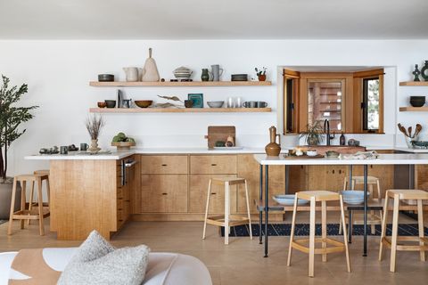
Open shelves become a de facto installation for the couple’s vintage accessories. Otherwise, Samson kept the palette simple, with oak cabinetry and coordinating stools from Industry West surrounding a custom island.
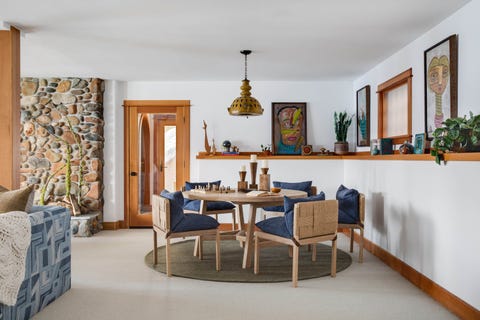
Dining Room
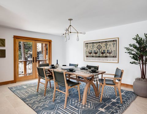
Dining table: Jacob May. Dining chairs: Barnaby Lane.
Powder Room
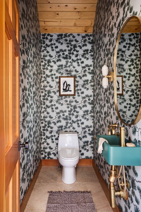
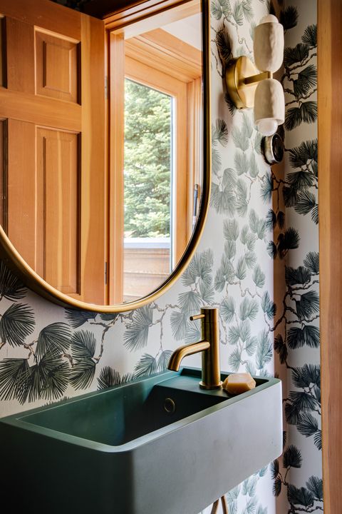
Samson’s one nod to the home’s former forest motif comes in the form of a powder room covered in a leafy wallpaper by Scalamandré, offset with a modern mirror from Rejuvenation. Sconces: In Common With. Sink: Nood Co. Art: Kimberly Moore Art from Chairish.
Primary Bedroom
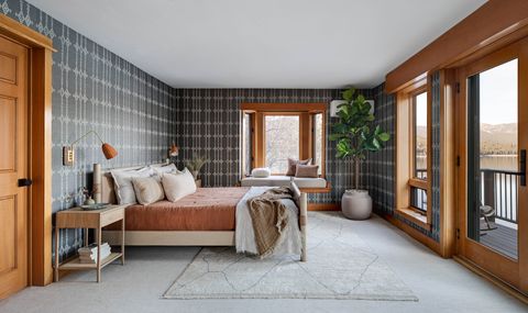
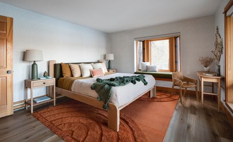
Samson eschewed heavy drapery in the primary bedroom to maximize the views—and emphasized connection to the outdoors with a terrace and cozy window seat. The Peter Dunham wallpaper gives the room a warmer feel than the airy open spaces. Bed: Lawson Fenning. Nightstands: Faithful Roots. Sconces: Blue Print. Rug: Lolan. Pillows: vintage from Blue Springs Home.
Primary Bathroom
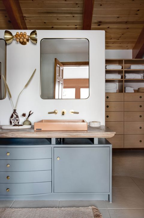
Sinks by Concretti and a custom curved vanity add character to the primary bath. Light: DL Design Works.
Son’s Bedroom
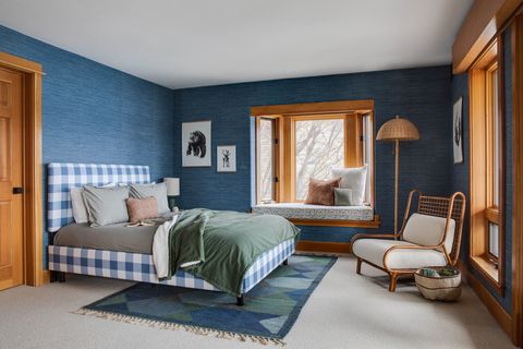
Samson kept the son’s room from feeling childish while incorporating playful elements, like the oversized gingham on the bed and the graphic rug, a 1960s design by Ulla Parkdal, found on 1stdibs. Wallpaper: Thibaut. Chair: CB2.
Guest Room
Nightstands: Saffron & Poe. Bed: Lawson Fenning. Headboard and window seat upholstery: Zak + Fox. Wallpaper: These Walls.
Entry
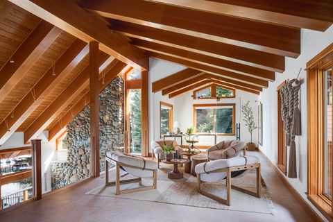
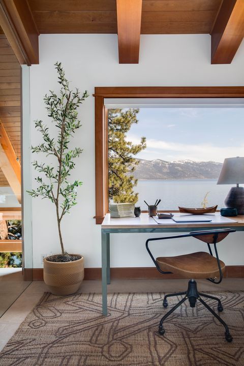
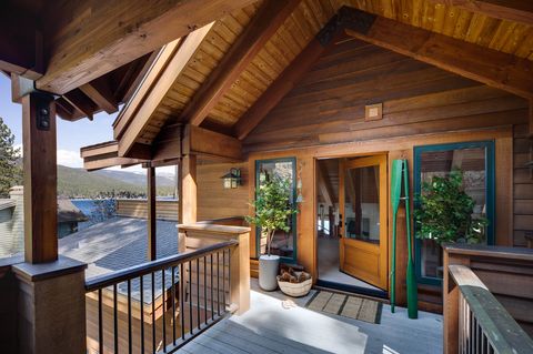
Samson added a glass wall to divide the upper level (where you enter the home) into a seating area and office—without sacrificing access to light and views in either. A Nanimarquina rug and rope sculpture by Cindy Zell add warmth.
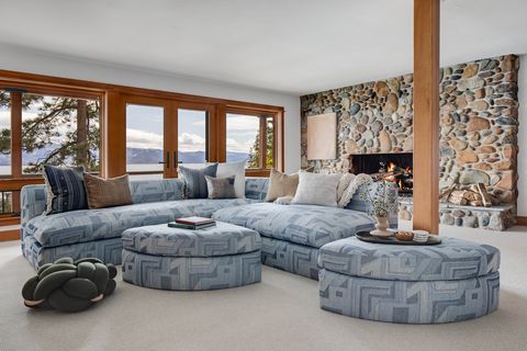
Lower-Level Living Room
“We designed a lower living room that is multipurpose for kids and adults alike,” explains Samson. The custom sofa and oversized ottomans (upholstered in a Schumacher fabric) “can be configured in a variety of ways for extra seating, a game table, and plenty of lounge furniture that can be moved around easily.”
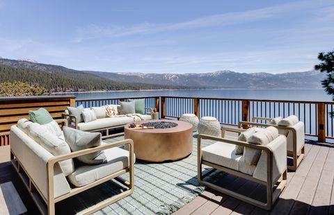
Upper Deck
Getting the fire pit to the upper deck required months of planning, permits, and a crane to lift it into place. But it was worth the hassle: “The clients tell me it is their favorite outdoor spot now,” Samson says.
Explore More of the House
Q & A
House Beautiful: How extensive was the project? Full gut reno, just paint/furnishings, or other—describe scope.
Jen Samson: We were brought on to the project to completely update and remodel the home so that it was more suitable and aligned stylistically with the new homeowners. That included quite a bit of interior construction including all new flooring materials, removal and redesign of some cabinetry, new masonry work, custom kitchen island, adding in a glass wall enclosure for the upper level office, new front door and windows at entry.
HB: What was the reason/inspiration for the new design? What are a few ways you achieved your vision?
JS: Per our clients’ direction, the home was to embody a lake home rather than a mountain home. They wanted to make it about the water, not about the skiing (both very prominent in this area. With that in mind, we worked to remove anything that felt like a mountain cabin and bring in a light, bright fun lake house vibe. The clients are a young couple with 4-year-old son and they planned to spend time with family and friends vacationing on the lake primarily during the summer months. The furniture selections are elevated yet durable and casual. We also focused quite a bit on the outdoor environments, adding a built-in bbq to one deck and an enormous fire pit on another. We wanted to maximize the livability of these spaces and give the family plenty of room to spread out and have fun!
HB: Did you encounter any memorable hiccups, challenges, or surprises during the project? How did you pivot?
JS: The biggest challenge of this house is also what makes the location of this home so special. The street is one-way street, extremely curvy and challenging to navigate, so getting anything moved into or out of the home proved to be a very difficult endeavor. The biggest challenge was the large fire pit that we selected for the upper deck of the home. We had no idea how many hoops we would have to jump through to get the fire pit safely delivered to the residence. The GC on the project worked with city officials for months on the planning. We worked with the highway patrol to close the road completely in order to bring the crane in to carefully place it onto the deck. In the end, success! But a very nerve-racking process especially when the crane was swinging the firepit from the street over the house to the upper deck. The clients tell me it is their favorite outdoor spot now, with gorgeous views and a blazing fire to keep them cost during the chilly Tahoe summer evenings.
HB: Where did the majority of the budget go?
JS: The majority of the budget went into furnishing the home. From wall coverings to flooring, lighting, and everything in between.
HB: How did you save money/DIY/get crafty?
JS: Rather than taking out all of the cabinetry in the kitchen, we opted to keep what worked because of the gorgeous wood, a clear vertical grain Douglas fir from old-growth trees and the quality of the workmanship. We removed some of the heavy upper cabinets as well as the peninsula and island and reworked the layout with a new, more modern feel. We also kept the majority of the vanities in the bathrooms and updated them with new paint, hardware, sinks, and lighting fixtures.
Hadley Keller is House Beautiful’s digital director. She oversees all digital content for the brand as well as working on the print magazine. She has covered covering design, interiors, and culture for 10 years in New York. She served as Associate Market Editor, Design Reporter, and News Editor for Architectural Digest and AD PRO before joining House Beautiful. Hadley is a staunch maximalist and vocal opponent of the Open Floor Plan.
