The common interior design mistakes that experts always notice
Any element of home improvement and refurnishing can prove costly to get wrong, which is why it’s so important to avoid the most common interior design mistakes altogether.
Because while it’s easy to feel excited by the latest trends, whether it be contemporary kitchen trends or bold new bathroom trends, trend-led styles can end up as expensive mistakes if they’re done badly or don’t work in your home – even the wrong paint colors can devalue homes.
From choosing the wrong furnishings to miscalculating measurements, there are a surprising number of interior design mistakes that are all too easy to make so we’ve enlisted the help of leading interior designers and experts to share their advice to avoid the key design mistakes they see time and time again – advising on ways to overcome each one.
Common interior design mistakes to avoid
1. Following trends over tastes
(Image credit: Getty Images | Imaginima)
While the latest interior design trends are there to inspire, they are not there to impose decorating choices that don’t suit your own personal tastes, which can lead to major faux pas when it comes to redecorating.
“There is often a sense of urgency to keep up with the latest interior design trends, which you may or may not fall out of love with a few months down the line,” warns Giverny Simm, Design Manager at bespoke interior design company, Hatch Interiors (opens in new tab). “I would always advise clients to carefully consider the following before acting upon impulse: how long will I love it for, how long will it last and how much do I really need it?”
“This is one of the biggest mistakes that we see, and we can all be culprits at times because trends are popular for a reason,” agrees Corban De La Vega, at DecorMatters (opens in new tab). “Following trends, however, is dangerous because we can find ourselves changing our home aesthetic from season to season. We highly encourage people to create a home that they will treasure for years to come, and save yourself tons of money at the same time.”
2. Choosing furniture that doesn’t fit
(Image credit: Getty Images | Creativa Studio)
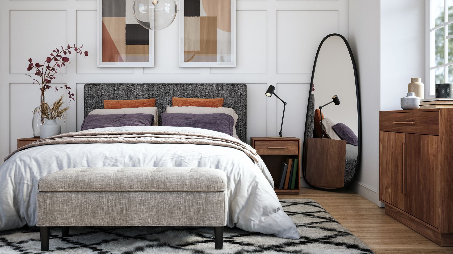
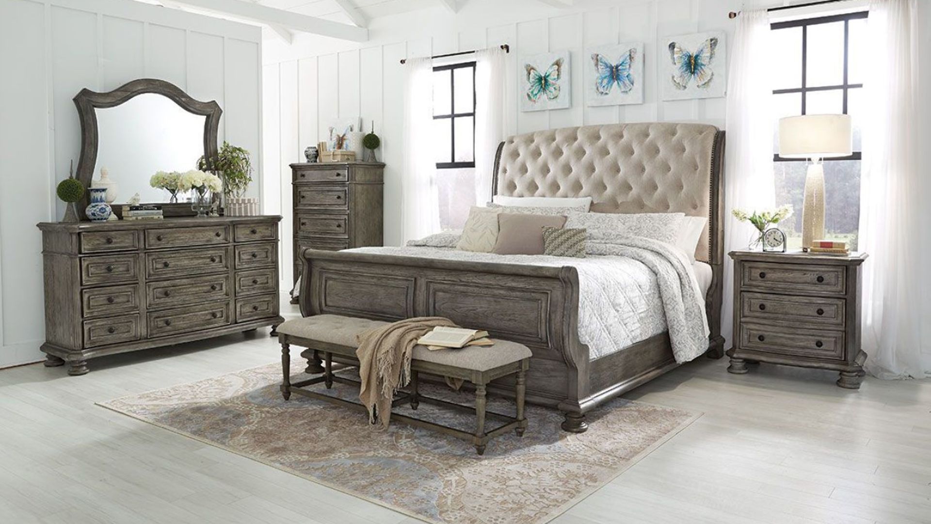
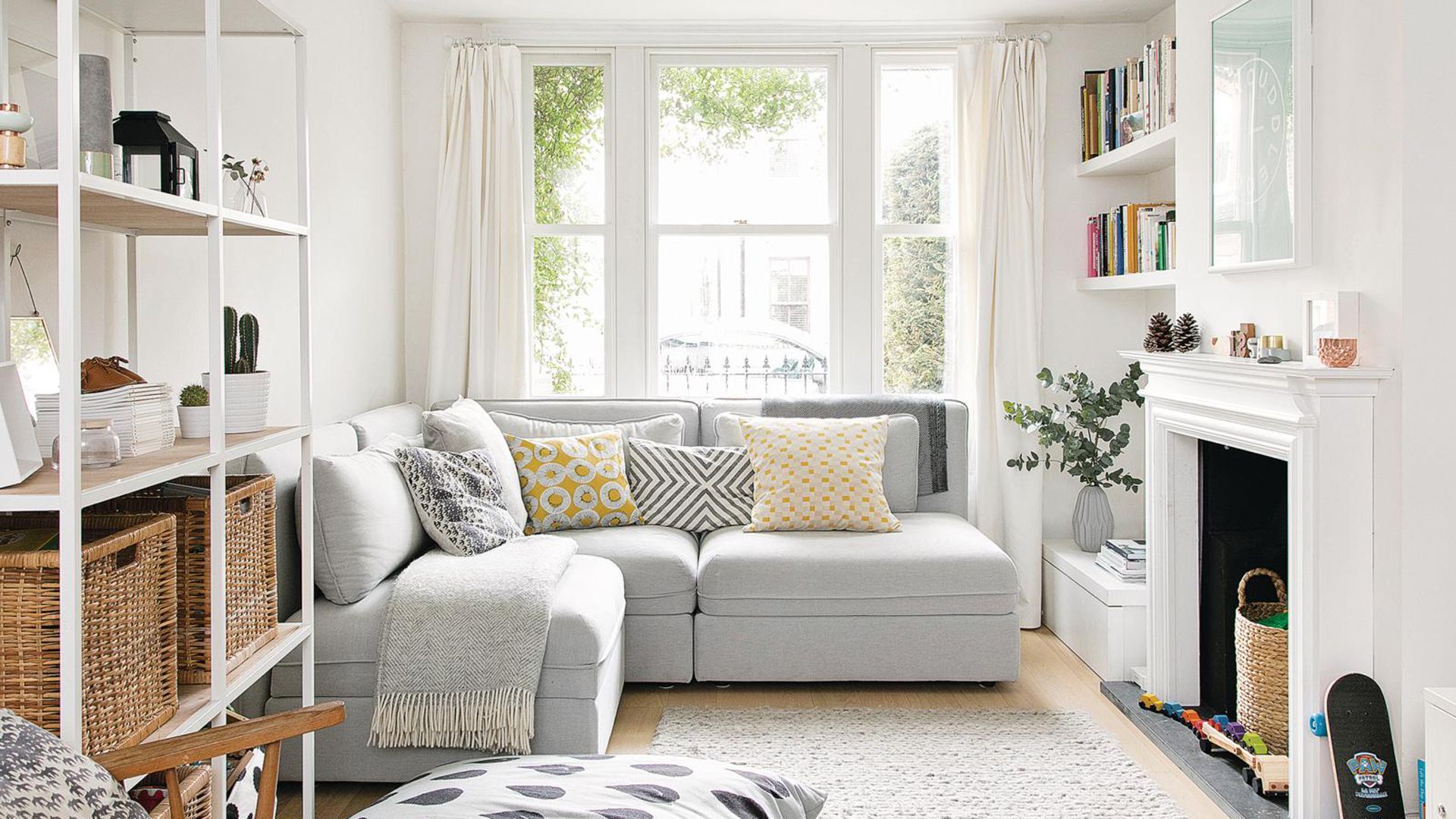
An easy but common mistake to make is falling for furniture that compromises the space available. “Triple check dimensions of an item you want to purchase,” stresses Giverny. “People often ignore things like heights and depths of pieces which can result in a space feeling smaller than it is intended.”
“The most common mistake we cross when refurnishing a room is having the furniture be too dominant in the room,” says Badcock Home Furniture’ (opens in new tab)s lead designer, David Horvath. “You want to take time to measure each wall but also factor in where your windows and other points of light are coming from. You do not want to lose any natural light you may have in the room.
“If you’re redecorating a smaller, say 15′ x 10′ living room, you want to stay away from the oversized sofas and sectionals. You want your walkways to be large and comfortable.”
Giverny explains, “a bedside table, for example, should sit no higher than 10cm above your best mattress but ideally should sit in line with it so you can easily switch on and off bedside lamps or grab a glass of water in the middle of the night.”
“Another item to double check for height is coffee tables, again you don’t want to be reaching too low or too far from where you are sitting on the sofa for the television remote! “
“A top tip when purchasing larger items such as beds, sofas, and even armchairs would be to use masking tape on the floor to map out your room and ensure you are fully happy with the space you have between items before purchasing.”
3. Not testing paint colors in all lights
(Image credit: Future)
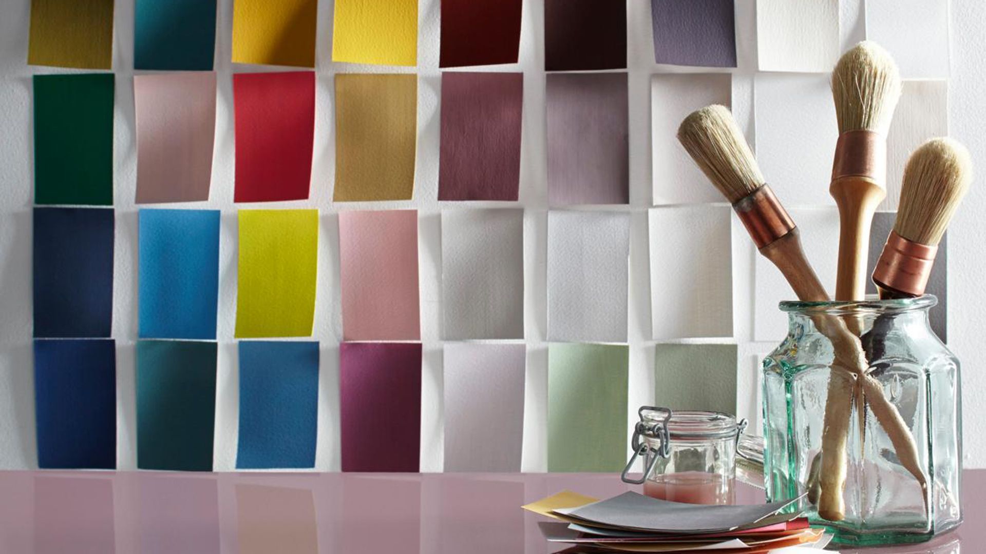
Paint colors look different in every room and at different times of the day, ultimately changing the whole aesthetic of the decor throughout the day. So before you choose the best living room paint or best bedroom paint color, the correct prep is essential if you want to avoid a costly repaint on your hands.
“Narrow down your paint samples and paint up some white cards and place them on the walls you intend to paint,” suggests Giverny, “make sure you observe those colors both during the day and at night in both natural and electrical lighting to make sure you are 100{a57a8b399caa4911091be19c47013a92763fdea5dcb0fe03ef6810df8f2f239d} happy. You’d be surprised at how many colors look completely different at different times of the day.”
4. Mismeasuring curtains
(Image credit: Getty Images | Onzeg)
Window treatments are an investment, with no cheap option that satisfies the needs of every window so often bespoke is the only viable design solution, and therefore can be a costly error of misjudgment if you get the choice wrong.
“A common mistake I often see is curtains falling far too short,” states Amy Wilson, interior designer for 247 Curtains (opens in new tab). “Whilst the type of curtains is entirely down to preference, as for the length, they should always fall to the floor with a little extra for puddling. This not only has the practical benefit of keeping in the warmth during the cooler months but also looks far more elegant, helping to give the room a sense of luxury.
“If you’re unsure of how to measure curtains, always ensure you include your rail when measuring and size up rather than down if you’re unsure.”
5. Choosing a rug too small for the space
(Image credit: Future)
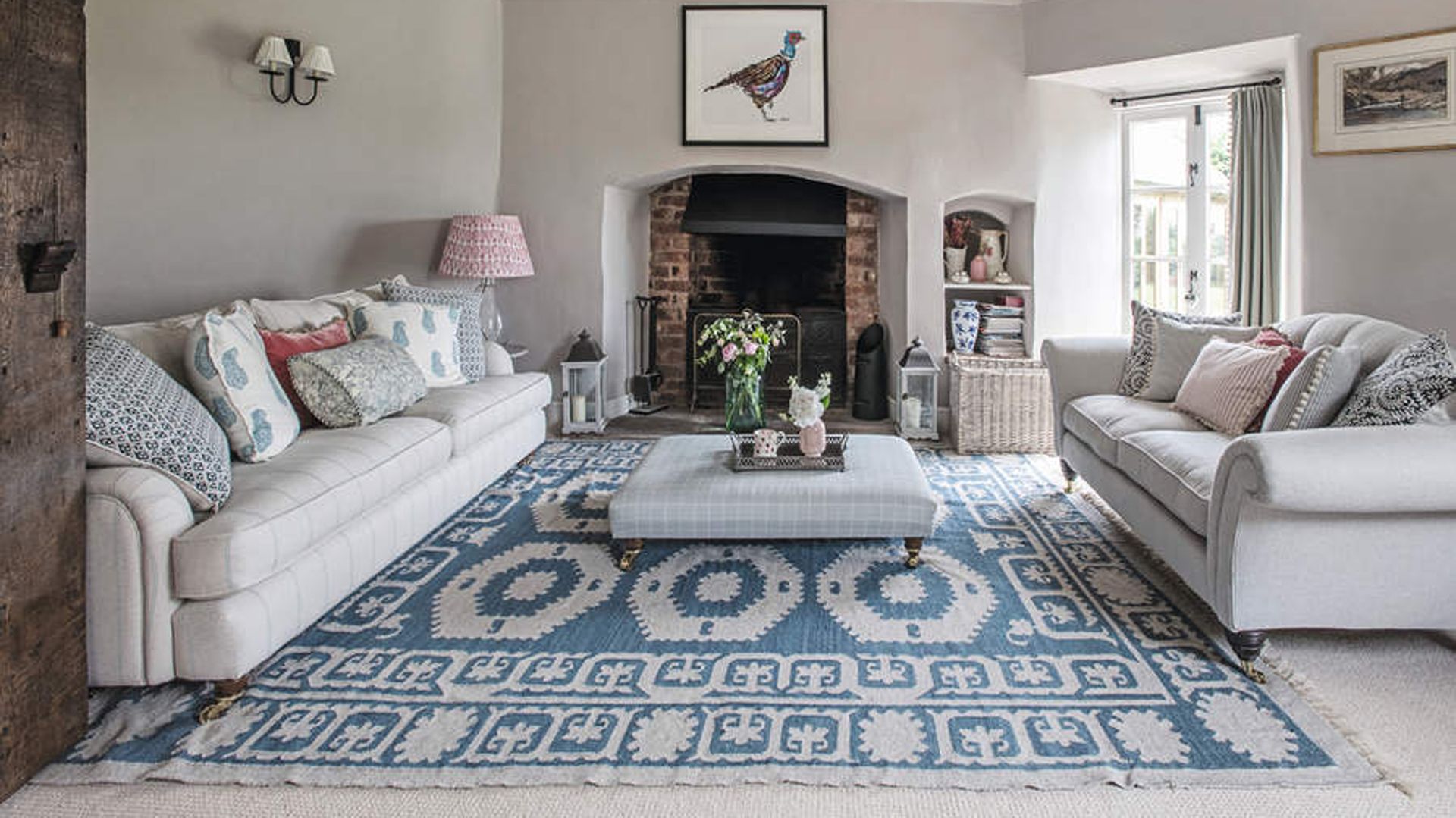
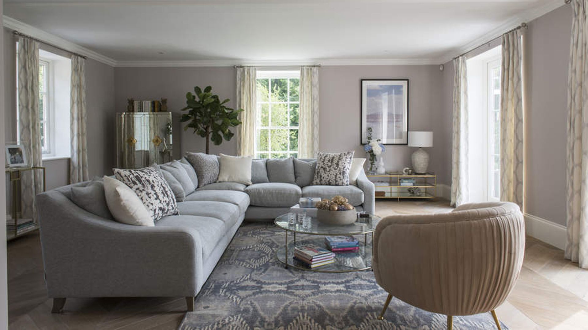
Rugs are valuable in any room, even more so when they fit accordingly to enhance the space rather than hinder it. “A major design flaw with an easy fix is selecting a rug that is too small for your space, ” explains Zara O’Hare, interior design specialist at Land of Rugs (opens in new tab).
“Selecting a rug that properly fits within your room will make it feel more open, while a smaller one will section it off and make it appear smaller.” A very useful tip when looking at how to make a small living room look bigger without expanding the space.
Zara goes on to advise, “a rug should be large enough to fill most of the space within a room, for a living room most of the time this means at least 8’ by 10’ unless your space is very small.”
“Rugs can be expensive, so if you are on a budget try looking for one that is a neutral color and simple material that will still tie a space together without breaking the bank. Another option is to layer a more expensive one on top of your budget rug. This will allow you to have a nice material or pattern without accidentally sectioning off your space. “
6. Over complicating a color scheme
(Image credit: Badcock Home Furniture)
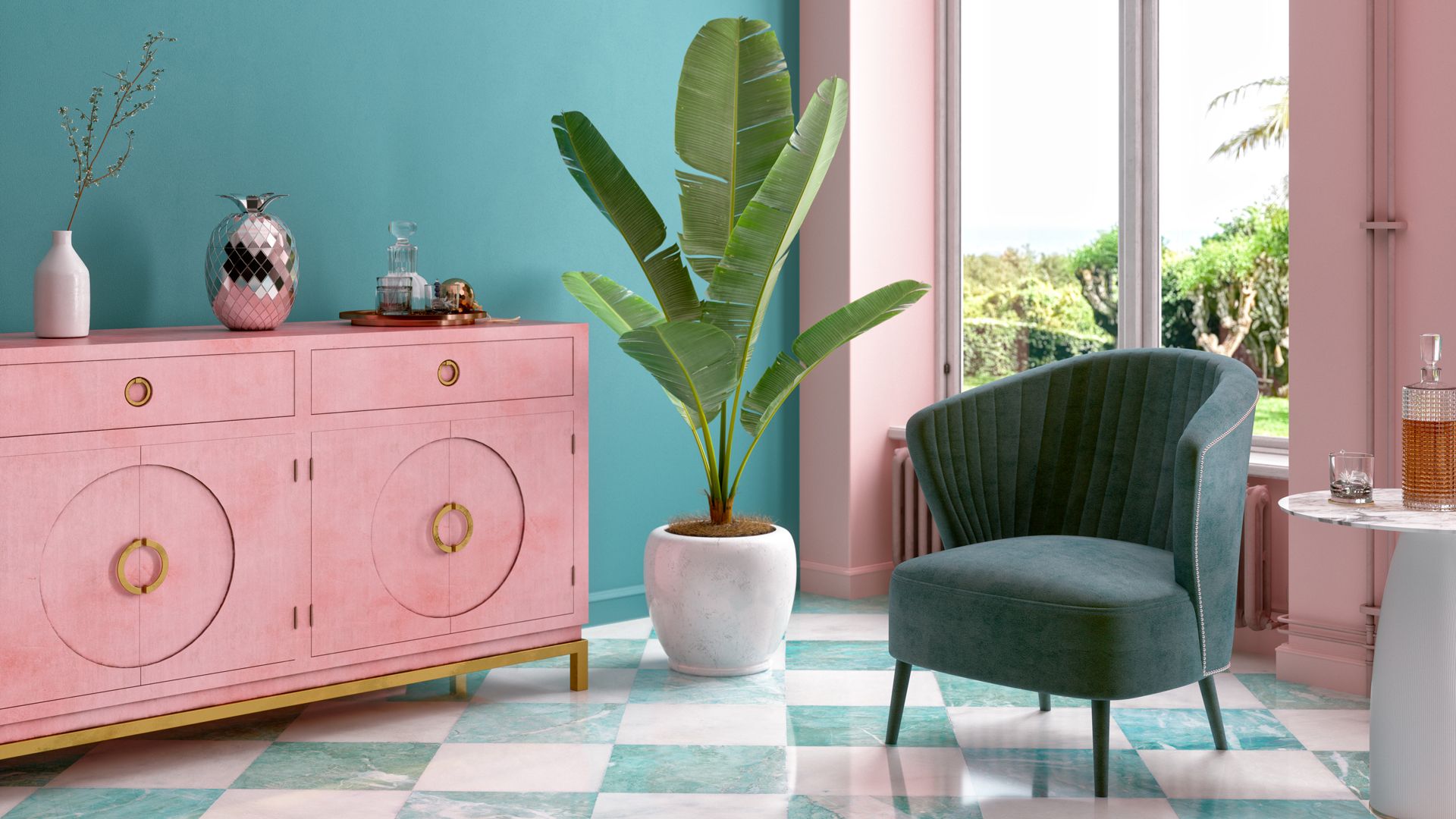
Balancing your favorite interior paint colors is key to creating a cohesive scheme, as opposed to a chaotic one. “Another issue we see with interior design is over-coloring a room. We all love color but what we don’t want are seven colors fighting against each other,” says David, “because this will take away from the overall aesthetic you are trying to create.”
“Start with two colors and build from these tones. Stay away from colors that clash and go with hues that flow well together. We want vibrance and brightness not a rainbow of mismatched colors.”
That’s not to say only use the best white paint colors for safety, merely that a few select complementary colors are generally more pleasing than lots of clashing tones. We are currently loving the latest sophisticated pink paint colors paired with serene sage green for a subtle boldness that works beautifully together.
7. Miscalculating wallpaper
(Image credit: Future)
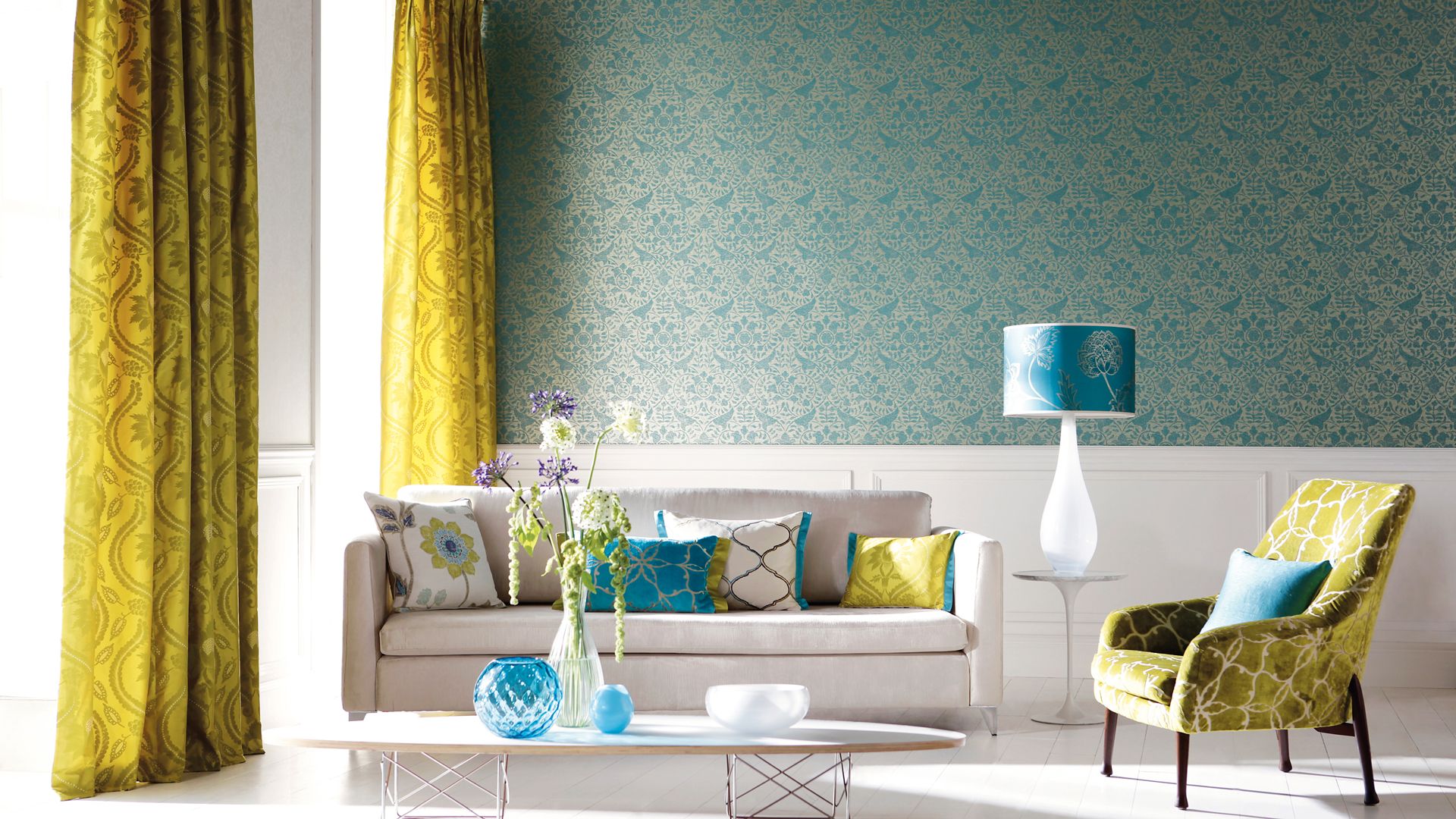
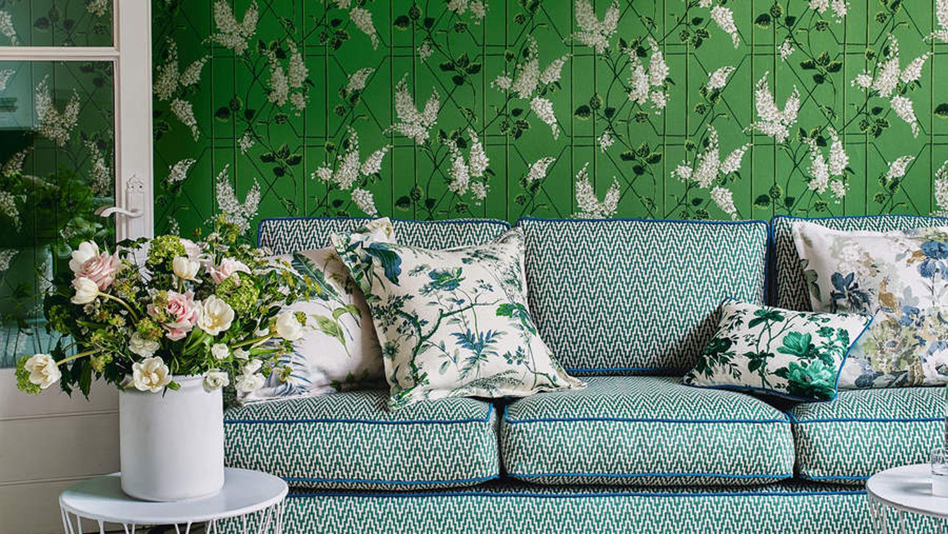
Before investing in the latest must-have wallpaper trends, ensure you’re not making this costly wallpaper mishap. “One of the biggest interior design mistakes is miscalculating the amount of wallpaper you need,” explains Emma Deterding, Founder and Creative Director, of Kelling Designs (opens in new tab).
“We frequently have this problem, with decorators over ordering and huge amounts of paper being wasted, so it’s important that you (or your decorator) get this right.” Offering advice on how to measure correctly Emma says, “make sure you take the width and drops of the walls, get the width and the repeat of the wallpaper and the length of the roll of the paper. These simple, yet important factors and measurements can make all the difference to how much wallpaper you need.”
“Always double check the quantities and if necessary ask the supplier – they are often super helpful and will prevent you from making a costly mistake. Another thing is to always make sure that every roll of paper comes from the same batch. Most people don’t realize that every printed batch will be minutely different from the next, but it is so noticeable when a different batch is hung next to an existing one. Remember, always keep a spare roll of paper in case of any damage in the future.”
8. Underestimating the importance of lighting
(Image credit: Getty Images | Eoneren)
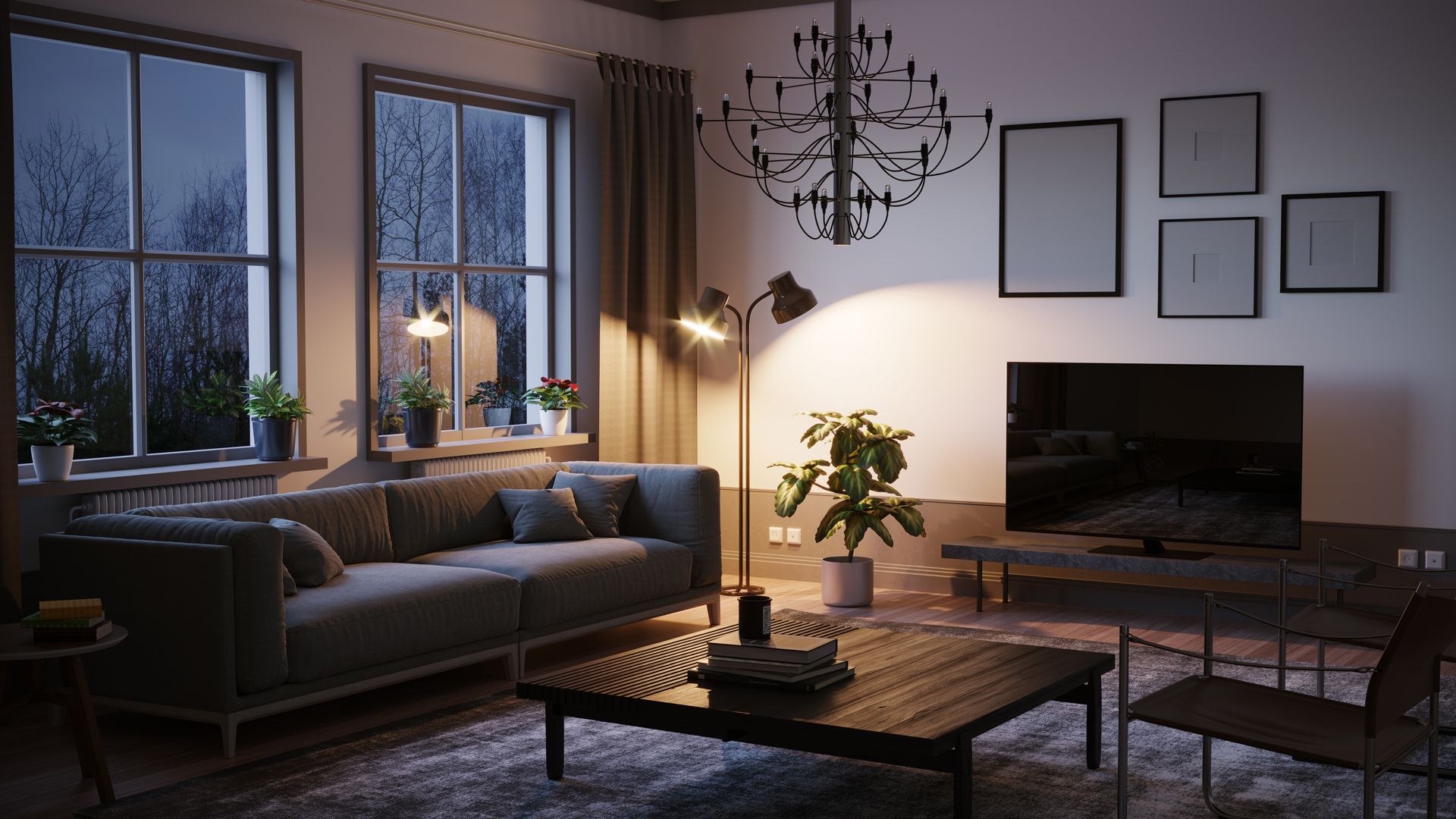
Lighting plays a fundamental role in any room, not just to determine the look but also how the room functions.
“One thing many people often neglect is lighting but it really is one of the most important elements in every room of the home,” says Amy. “Opting for a single pendant and maybe one other floor lamp or table lamp is not sufficient for building a sophisticated, considered look. Every room should always have multiple lighting options available, whether wall lights, table lights or even USB lamps that can sit in the center of your coffee table. More is definitely more where lighting is concerned.”
9. Misplacing furniture
(Image credit: Future)
The layout and positioning of furniture is incredibly impactful for the sense of space and therefore a key interior design aspect to take into consideration when determining the feel of any room.
“Placing furniture around the edge of a room up against the walls is a very common interior mistake, perhaps due to thinking it creates the illusion of a larger space,” says Amy. “However, this dated style can often have the opposite effect. Bringing sofas and console tables just an inch or two away from the wall can make a room feel much more luxurious and spacious. It is also a great way to break a larger room up into different functional areas whilst maintaining the open space feel.”
10. Losing perspective within open-plan living spaces
(Image credit: Getty Images | Klaus Vedfelt)
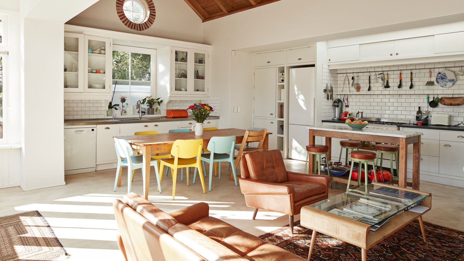
While there are many benefits of open-plan living spaces it can be valuable to zone off distinct areas to serve different purposes and create a more intimate feel. “Open-plan spaces are increasingly popular and are great for entertaining, but can sometimes feel sparse or empty,” warns Martin Waller, founder of interior design emporium Andrew Martin (opens in new tab).
“Use contrasting colors to demarcate distinct spaces and inject personality into different areas of the room. Choose darker colors to create intimacy in a dining area and opt for neutral shades to make kitchens appear brighter. Wallpaper can also be used in certain areas of the space to create a distinct zone.”
Martin also adds, “use statement lighting to create different zones, that each has a purpose. Hang pendant lighting over dining areas and use task lamps in corners of the room to create cozy areas for reading.”
“Open furniture, such as cabinets, bookcases, or shelving can be used to create different zones, without making the space feel closed in. Alternatively, a folding screen can provide privacy, something that is often lacking in open-plan living.”
11. Rushing decisions
(Image credit: Future)
Sure, walking into an interiors showroom and buying everything all matching and available is the easiest way to style any room in your home, but it will distinctly lack curation and personality so take the time to sit with your ideas before investing.
“The best way to create an individual style is to select each piece individually. It may be easy to pick everything to match and go out and purchase a full set of matching vases, but in reality, you want the character of the room to be embraced,” advise the interior specialists at Living Cozy (opens in new tab). “Never rush into decorating, buy piece by piece where you can and make it easier to switch pieces in and out further down the line.”
Giverny agrees by saying, “We often look for a quick-fix and purchase furnishings to ‘make do’ instead of waiting to find pieces that are right for our homes. It’s best to wait until you find something you love, rather than buying the first somewhat suitable item you find, which could lead to unnecessary replacement purchases in the future.”

